
This week Patti challenges us to select three photos and present them in both color and black & white. She asks us to compare the differences in each one, and share our thoughts about how color vs B&W process impacts them. This was a great learning experience for me, and I was lucky that Creighton helped me get the possible pairings whittled down to three.
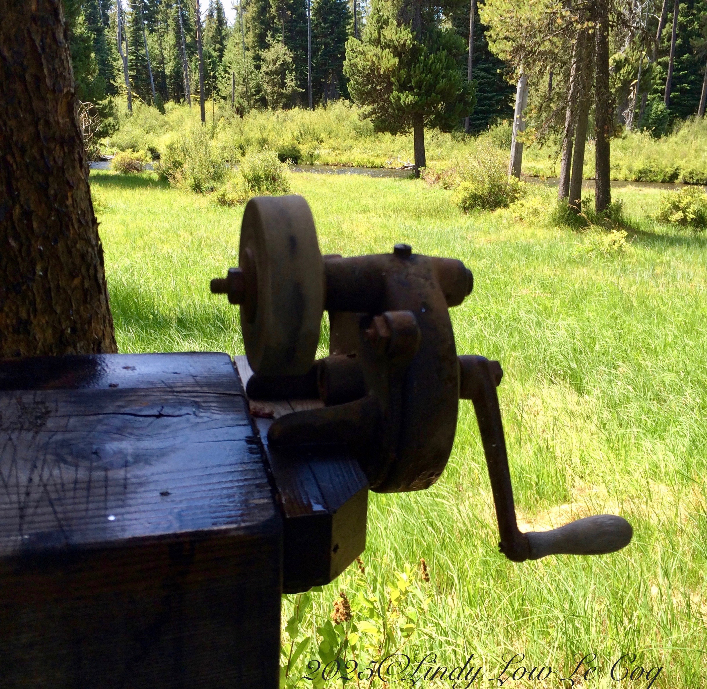
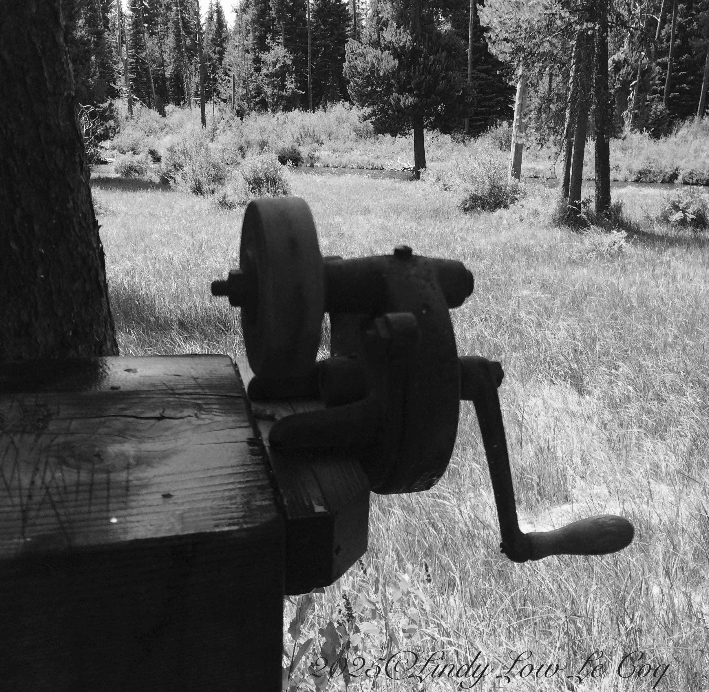
This knife sharpener attached to a fish-cleaning station drew me in. I love old pieces of iron work. In the color shot the grass and trees of the landscape draw my eyes away from it. Although I love lush backgrounds and its rusty surface shows better in color, I prefer the black and white because it keeps the grinder as the main focus.
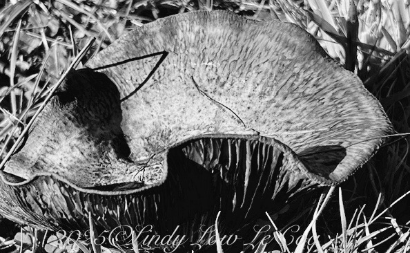
What is this odd thing on the ground? A skull? A castaway piece of rubber? Maybe a Chihuly bowl?
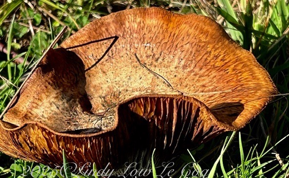
Actually, this is a large toadstool that has shed its spores and is beginning to fold in on itself. I almost always favor color in photos of flowers, plants and natural landscapes. Big toadstools have something akin to an architectural structure though, so I like them both ways.
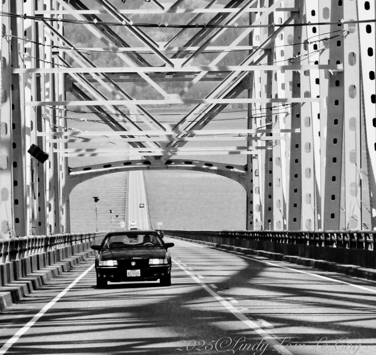
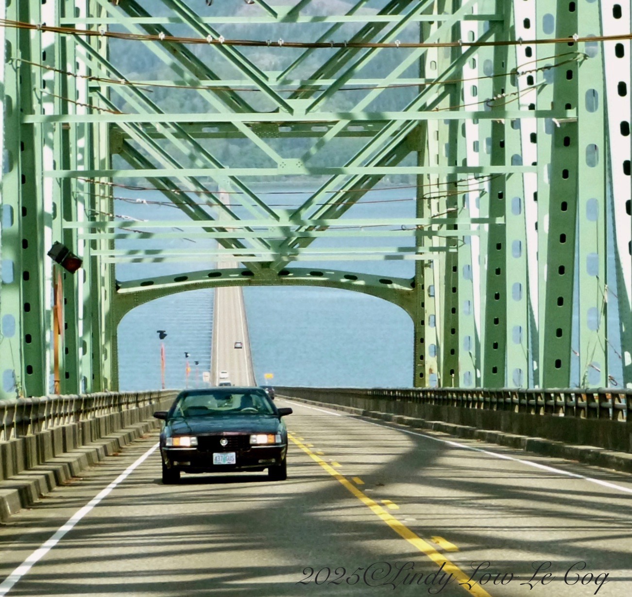


Lindy, these are fantastic examples. I loved how you elaborated on each. My reaction is very similar to yours. The grass detracts the viewer’s attention in the color version in the first pair. The second photo is beautiful in color, but the black and white creates an intriguing abstract. Finally the bridge photo is perfect for black and white for the exact same reasons you stated.
Thank you, Egídio. I’m always pleased to read your response to my posts. Somehow you help me feel more confident in the choices I make!
These are very interesting examples for this challenge Lindy. I like the knife sharpener in color because I can see more definition; the other two in B&W for the same reason – I can seem ore definition.
Thank you, Anne. It’s so interesting that everyone has their own reasons for liking either the color of B&W images, and that from my perspective, everyone is right!
Art is subjective! Take care.
I too almost always prefer colour in photos of flowers, plants and natural landscapes. You have made good choices here, and I agree on the first one. The second one, the toadstool, I prefer the colour version. It’s easier to understand what it is! The bridge is a clear B&W to me.
Thank you, Leya. I love that everyone has their own opinion about whether the photos are better in color or B&W, and we are all right!
♥
Lindy, great choices for the challenge. I like the knife sharpener and the bridge in black and white. I prefer the mushroom in color.
Thank you, Beth. This was a heck of a lot of fun!!!
Great choices, Lindy. It’s interesting…..when I first looked at the color version of the bridge, I thought you were highlighting its “retro” colors! But the b&w version really highlights the shapes, lines, angles. The other 2 images…um…I think I prefer the b & w for each one.
Thank you, Patti! The wonderful thing about this challenge is that everyone has their own opinion of which is better, color or B&W and we’re all right!